
BrianAnsari & Associates
BrianAnsari & Associates (BA&A) is a consulting firm focused on Disadvantaged, Minority, Women-Owned Business Enterprises and Small Business Enterprises (D/M/W/SBE). As their company continued to grow, they realized they needed a web experience that was more representative of their work and their goals. They brought me on as part of my Springboard UX Design program to reimagine their website and increase their conversion rate.
The problem
BA&A is going through an evolution and needed their website to reflect the next chapter. There was an overwhelming amount of content, and much of it was no longer relevant to the company’s mission, so much of the content in the new site design was created after discussions with team members about the company.
The solution
After going through all of the content on the website and the collateral, I pulled what was important and melded it with what the leadership of the company felt was important to highlight.
My role
I worked with BA&A for 6 weeks on their new website design. I was responsible for establishing the content strategy, brand strategy, and final UI for the website based on a previous designer’s research and prototyping.
Tools used
Sketch, InVision, Pen / Paper, Zoom, Calendly


Goals for this project
Simplify the content to make it skimmable and intuitive
Streamline the user experience to increase conversions
Update the brand to better match the company goals
Content strategy
After meeting with the President of the BA&A to discuss his goals for this project, my top priority was shifting the content focus from company capabilities to user needs.
The original site was copy-heavy, and didn’t allow a user to quickly understand what the company did or the customers they served. The new site design offers skimmable headings, sub-headings, and body text, allowing users to get a holistic view of the company quickly.
Simplifying the navigation and choosing headers with clearer actions was important as well. This gives the user a better idea of where to find what they seek.

Before: Home
The home page above the fold is prime real estate, and on the original site, the banner image took up the entire space. Below the fold, all of the text is in bold, so none of it is prioritized.

After: Home
The new home page design gives users an introduction to the company, their experience, and what sets them apart. The three pillars below are the core of what the company does and stands for, giving the next level of depth into the company. Following that is a section for a quote from the founder, giving a personal introduction to why the work is so important to him. From there, the user can discover the target industries, and finally there’s a link to book a consultation with the team.

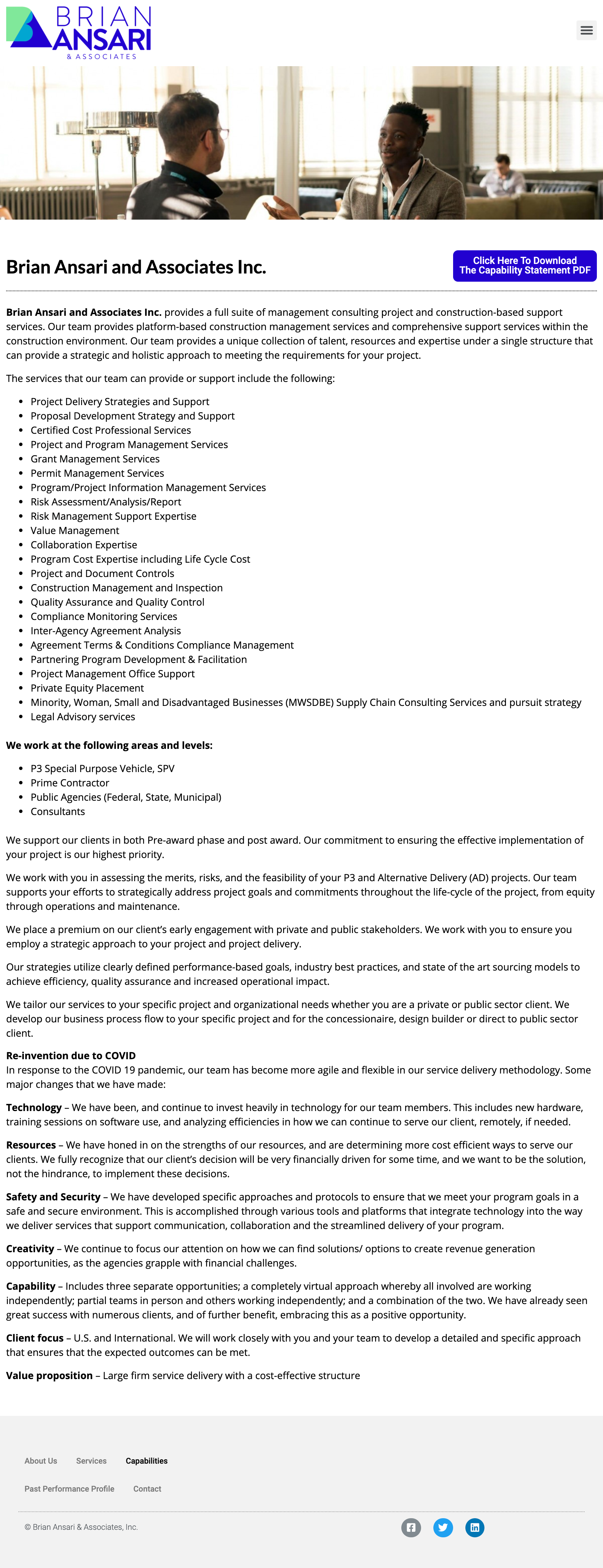
Before - Capabilities
Many of the pages on the original site (including this one, for Capabilities) had long, bulleted lists. The intention was to show a vast array of services, but in testing, most users found these lists overwhelming and abandoned them after 3-5 bullets.
Additionally, there are no headers to break up the content. The most differentiation is the paragraph text in bold in the lower third of the page. This made it difficult for users to find what the priority is for them to discover on the page, and ultimately they abandoned the effort.
Additionally, a Services page had even more text without headers or quick snackable content, so users struggled to understand the core mission of the company and what they would offer to customers.

After - Our Approach
My work on this project centered around finding the key pillars of the company, and allowing users to get a high-level view before diving in deeper. The new design and content for the Our Approach page took bits from Capabilities, Services, and the Capabilities Statement and broke it out into clusters of information. The bold headers are followed by a high-level message about the topic, and then there’s space for details.
In addition, icons help users quickly scan the industries served by the company, rather than reading through a long list. There is space to elaborate below for further clarification.
In the original design, the button for the capabilities statement had two lines of very small text. Most testing participants skipped over it and looked for it elsewhere. The new design features a thumbnail of the document, a bold header, and a clear CTA.

Increasing contact conversions
The main goal for the team was to increase inbound leads. The existing Contact page was busy - the background image made it difficult to read, and the text didn’t offer instruction on what to include in an initial email to the company.
Additionally, there were no details about their background in the industry or their specific experience, so I added a page featuring team bios and headshots.
Finally, I made sure that across all pages, CTAs were more clear and obvious to the user.
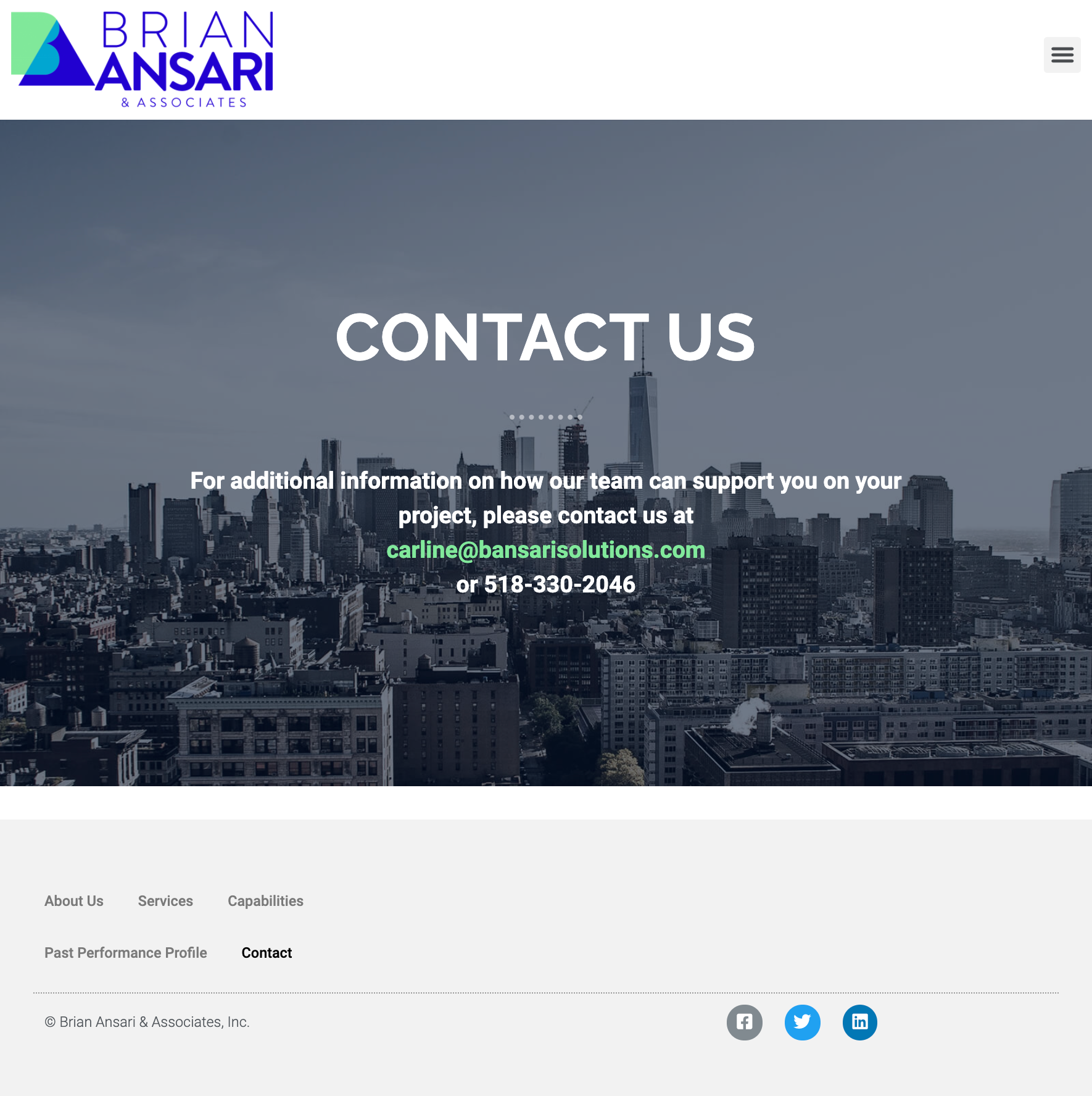
Before - Contact
The main goal for my client was to increase conversions, and get more inbound customer leads. The contact page was very casual.


After - Book a Consultation
A big frustration was that any inbound leads the company received were lacking in details about the contact and their project. By transitioning from a simple email link and phone number to a form, they are able to gather better information from the contact before their initial call. This allows the company to be better prepared for the meeting, and have better outcomes.
By simplifying the information requested, users are able to quickly and easily identify how they’re hoping to work with BA&A and what they’re looking for from their meeting. Additionally, by labeling the CTA “Book a Consultation,” users felt it was more professional than just “Contact.”

Humanizing the brand
Adding a team page gives a human element to the company - crucial for an industry based on establishing interpersonal relationships. The Ansaris’ bios also lend credibility to their expertise.

Brand refresh

Palette update
The brand colors needed a slight tweak. The original palette went for an analogous spread, yet felt disjointed and chosen at random - there was an extreme vivid dark blue, a warm green, and a more muted blue. The updated palette was a more tonally consistent version of the original that felt more professional - cooler colors that feel more unified.

Logo redesign
A logo is the first and most important way a company represents itself. The options presented gave a variety of ways to develop the brand.
The original logo had a few alignment issues:
The bottom of the shapes representing B and A did not align with the bottom of “& Associates” or “Ansari”
“Brian” did not align with “Ansari” on the left
“& Associates” did not align with any other elements
Additionally, test participants noted that the shapes felt dated, very reminiscent of the 80s. With that in mind, I provided a few options for the team, keeping the flavor of the original logo and also trying something new.
The first option kept the shapes, but fixed all of the alignment issues. The second option reverted the shapes to the letters they were meant to represent. The final option was more typical of what other consultants in their industry used for their logos, while still keeping the overlap design theme from the original.

Typography upgrade
Headings were sparse on the original site, so in the redesign, they were given a bold, serif treatment using Libre Baskerville for a bold and professional but accessible feel. The body text used was Open Sans to encourage legibility.
Try it out
Experience the new website for yourself through the prototype.
