Skin Insights
Skin Insights is a mobile-first site utilizing scientific insights from a cosmetic chemist, presented in layman’s terms for the everyday person to use as they evaluate products for their unique skin concerns and preferences. This site is information-heavy, so designing an easy-to-scan interface that wouldn't frustrate users with scientific language while still educating them about products and ingredients in a fun and engaging manner was the biggest design challenge. This was my capstone project for my Springboard UX Design program.
The problem
Whether you call it self care or vanity, skincare is a 145 billion USD industry globally, an increase of over 60% in the past decade alone, and consumers have never had so many choices. With an overwhelming amount of information, many consumers are overwhelmed with the overall experience of researching, purchasing, and using the right products for their unique skin.
The solution
I utilized design thinking as the underlying process guiding the creation of a mobile-first website, using an evaluation-heavy human-centered design approach, which helped me refine my ideas, test them in prototypes, and prove them through usability testing.
My role
I was directly responsible for all aspects of this project, from research and user interviews to prototyping and visual design, focused on feedback and evaluation to ensure that complicated scientific insights were accessible to users of every walk of life.
Tools used
Sketch, InVision, Zoom, Pen / Paper


Goals for this project
Reimagine the review process for better insights
Make scientific ingredient information accessible
Help users learn how to build their skincare routine

“In cosmetics alone, the EU has banned or restricted more than 1,300 chemicals while the US has outlawed or curbed just 11. It’s possible to find formaldehyde, a known carcinogen banned in EU-sold cosmetics, in US hair-straightening treatments and nail polish. Parabens, linked to reproductive problems, are ruled out in the EU but not the US, where they lurk in skin and hair products. Coal tar dyes can be found in Americans’ eyeshadow, years after they were banned in the EU and Canada”

A quick search of “skincare routine” generates over 207 million results on Google.
“Skincare” on its own - a whopping 746 million.
The skincare market value is estimated at over $135 billion, an increase of over 60% in the past decade alone. With an overwhelming amount of information, much of it biased by the manufacturer, many consumers are simply overwhelmed with the overall experience of researching, purchasing, and using skincare products.

Secondary research trends
Much of my research centered on a shift toward consumers demanding transparency in ingredients. The intention of skin care is that the products are absorbed through the body’s largest organ - the skin - so it makes sense that people are concerned with what’s absorbed into their bodies.
Other notable trends included a preference for products that are “clean” (which can mean many things: vegan, cruelty-free, non-toxic, food-quality), especially among younger buyers. This has influenced the founding of many skin care companies, most of which prefer a D2C sales model. Larger more established brands are shunned in favor of local / artisanal / natural products, and many try to buy out these smaller companies (their real competition) in order to stay on top.
Many people have sensitivities or allergies to various ingredients in skin care, but it can be difficult to nail down what it was that caused the reaction. People also use the wrong solutions for their skin types, and can inadvertently make their skin worse with the products they’re using.
Competitive analysis
Think Dirty, Shop Clean
MY RATING: 4.5 / 5
The app allows users to scan products and learn more about the ingredients and their potential health risks, while offering cleaner options. It gives great insight into product ingredients, and offers alternatives for products with potential health risks, but doesn’t provide suggestions based on user-provided information - just similar products to what they’re already using. The community feedback in the form of reviews, likes, and ratings is very helpful in making selections. Overall, this is the best performing option of the competition.
INCIDecoder
MY RATING: 3 / 5
The information included on this site is by far the most extensive of all the competitors. Although the organization and presentation of the data is overwhelming, the data is extremely helpful in assessing products. The site doesn’t give guidance on a routine, but it does have good information on what different products help with in a skincare routine. There is no community feature, although many of the products are user-generated.
Shelfie Skincare Routine
MY RATING: 3.5 / 5
The focus of this app is on organizing your skincare products, establishing and sticking with your skincare routine, and tracking your progress. This app is good in theory, but does not provide a lot of use other than a daily checklist. Seeing other users’ routines could be helpful, but there is a lack of information about other users (skin type, age, problem areas, etc.) that would be helpful in establishing which part(s) of the routine would be beneficial to another user. There is no additional information about the products (whether or not they are clean, their main usage, etc.).
Sephora Skincare Quiz
MY RATING: 4 / 5
Sephora is a global leader in CPG for beauty, and they are most interested in selling product. Their quiz helps users find new products to add to their cart, but again does not give suggestions on a full routine. It also doesn’t give information about why a certain product fits within the criteria provided (ex: why is a particular cream good for people in their 20s but not their 30s? Why would I want a serum over a cream?).

Each of these competitors has features worth noting, but none of them fulfill my goal of helping people understand the science of skincare, and how they can use that information to establish their own skincare routine based on their unique needs.
Finding my interview participants
I had 20 participants fill out a screener survey, both to gather deeper information on user habits and also to select interview participants for further insights based on four main criteria.

1. Users had to be actively trying new products. Anyone who hadn’t tried a new product in the past year was disqualified.

2. They had to have a routine with multiple products. Anyone using one (or less) products was out.

3. They had to have a routine, period. Anyone who didn’t have any semblance of a routine was removed.

4. They had to want to improve their skincare routine. Anyone who was not interested in this was excluded.


Meet my interview participants
My selected participants had a lot in common. For starters, as you can see, they all talked with their hands. But it was more than that – they were all looking to improve their skincare routine and had an interest in finding new products to suit their needs. They came from different walks of life – a choral conductor, a technology sales representative, a graphic designer for a real estate company – but they all had trouble finding the right products for their unique skin concerns.
Research insights
Effective ingredients
When it came to ingredients, my participants were more interested in effectiveness than “natural” or “clean” ingredients, in surprising contrast to the majority of my secondary research. They found this information in the form of reviews and forums (see below), where others would tell their personal experiences with the product in question, and sometimes even offer a better alternative based on their experience. There was more trust in other people than in the companies themselves. In my session with Nicola, she said, “I’m a science-y person and I’m a skeptical person, so I get annoyed when I can’t trust the clinical data behind statements.”
Deciding factors
When it comes to “deciding factors” for a purchase, the most frequent answers were effectiveness (determined by reviews and forums), price, and ingredient preferences (allergies, specific chemicals, or overall “clean” ingredients). These elements were crucial in developing empathy for my user and developing my user persona.
Reviews and forums
There was an overwhelming focus on reviews and forums as a source of quality information, but a surprisingly underwhelming interest in contributing to those forums or writing reviews for others to use as a reference. In my session with Bonnie, she mentioned she relied heavily on forums and reviews to get input from others on their experience with a product, but when it came to leaving a comment or review herself, she said, “I’m not into internet commenting and review-leaving in general.” This sentiment was echoed by multiple interviewees.
Uniqueness
Most of my participants talked about their skin’s “uniqueness” - they expressed frustration that because their issues were so unique, they struggled to find product suggestions catered to their unique issues. Hours and hours spent scouring reviews and forums hoping to find someone with their exact same problem who might call a product their holy grail, or on the flip side, a “never again.” In my session with Kelly, she confessed, “I don’t actually know what’s right for my personal skin.” Cassie expressed frustration when people who don’t know her or who don’t know her skin try to tell her what would be best for her.
Quizzes
Another surprise came in the form of quizzes. Many eCommerce sites like Sephora offer quizzes to help you find a new product, while sites like Buzzfeed might help you make sense of your skin type so that you have better luck searching for products. Although they were interested in the format of the quiz, participants also expressed a lack of trust in the results of these quizzes - many of the products offered are simply best sellers, and most of the questions are quite vague, suggesting that the companies are really just pushing the same few select products on all users rather than actually identifying a unique selection.


Building my persona
The target audience wants to build a custom skincare routine tailored to their skin concerns, ingredient and price preferences. They also want to find a trusted source of information, as many marketing materials and advertisements are misleading, and it’s difficult to find honest reviews from people with similar concerns. They often take casual quizzes (in the style of Buzzfeed) about skincare, and visit forums to learn more about the experiences of others with certain products or routines.
Redefining the problem
It’s about making the science behind skincare accessible, and empowering users
to make educated decisions about what products they’ll use in their skincare routine.
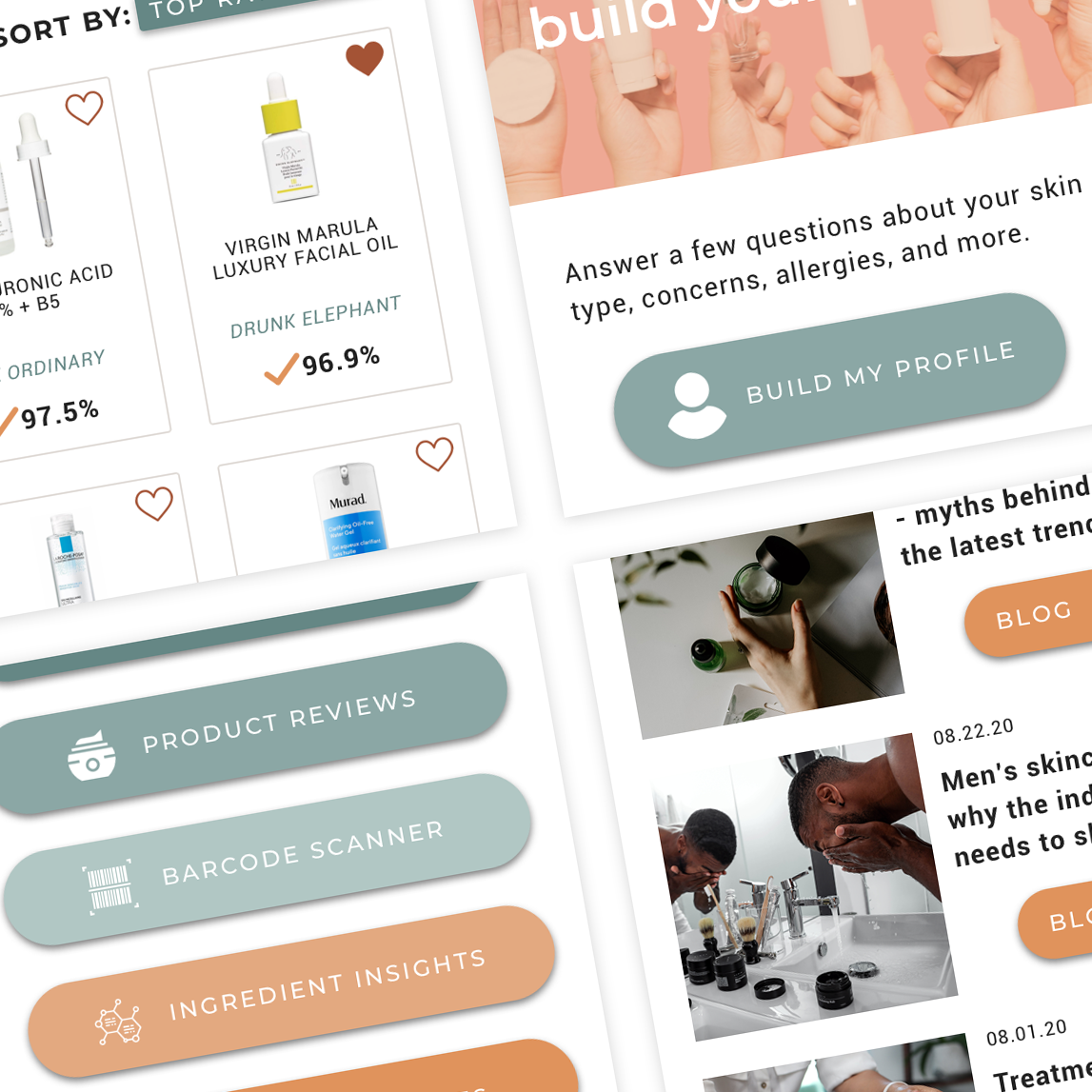
Gamification of profile builder
To simplify and streamline many of the tasks throughout the site, creating a profile and storing your information is key. Many participants noted that they enjoyed taking skincare quizzes, so the profile builder is structured more like a quiz than a traditional form to encourage use.
All profile information is utilized throughout the site:
Skincare routine creation is based on profile data (how many products you want in a routine, your budget, skin type, etc.)
Leaving a review includes pre-populated information about your skin and demographics
Product browsing is pre-filtered by ingredient preferences and price points
Browsing reviews is pre-sorted by people with similar skin for easier decision making
Accessible scientific insights on all ingredients
Ingredients were critically important to many of my participants, which led me to include a full page listing of ingredients, with a quick symbol key to the best and the worst ingredients, and full detail pages for each ingredient in layman’s terms so that the user could learn more if they wanted to do so.
Users also have the option of excluding any ingredient from their searches, to accommodate allergies and sensitivities.
No one likes leaving reviews; everyone loves reading them
Reviewing a product was a noted pain point for many participants. To improve that process, the review page included pre-populated information from their profile, making it easier to note an adverse reaction based on an existing condition.
I also abandoned the traditional 5-star rating and go for a percentage-based score – if 97% of users say it’s effective, that’s easier to understand than 4.2 stars –making the review process a simple “yes, no, not sure” scheme for effectiveness rating. Effectiveness was key to my participants, and 1-5 stars is arbitrary, especially when it comes to skincare.
Interviewees noted that they didn’t like reading long reviews that never got to the point and just wanted to vent, so there is a limit of 140 characters in the free text field to ensure that users are getting right to the point.
Early sketches
I experimented with various styles for the main product browsing page. I was interested in seeing how users responded to horizontal scrolling content, where they expected to see various elements like filters and sorting, and what they found to be the most intuitive way to organize product types.
On the product detail page, I experimented with various blocks of information to see what was most important to the user.
I wanted to explore new ways to get insight through the review process, departing from the traditional 5-star method and opting instead for a percentage rate of effectiveness.
Ingredients for skincare products are complicated, but they don’t have to be! These sketches explored ways to make scientific data accessible.

Visual design
When selecting my palette, I went through a few iterations. I landed on shades of cool teal and warm skin tones, which give a neutral and natural feel to the site. Most text is dark on a white background, while some headers are in an accent color to ensure that it’s easy to read.
I chose the fonts Montserrat and Roboto because their shapes are clean and accessible. They both have multiple weight options, allowing for variety, while still maintaining legibility. Because of the nature of the content, many screens are text-heavy, information-laden pages, so it was important to prioritize legibility. Various elements are highlighted over an image or a block of color, adding a bit of visual variety to keep the user delighted.
Usability testing findings
Purpose of the site was unclear
There was a lot of confusion about the purpose of the site – users were unsure if they could purchase items on the site, or whether the company manufactured custom products to sell directly. In the second round of testing, I deployed a splash page with language about the company, but it was not effective. The final design includes a brief statement on the home page indicating that it is an informational site rather than a store, which is more effective due to more concise language. Users in round 2 didn’t read the splash page because it was too much content, so concise language was important.
Resource page design was confusing
The resource page design and name was confusing, as multiple elements looked like they would be clickable, and users weren't sure what Resources would mean. Users also mentioned that they were used to the entire area, including the image and title, would be clickable to access the site. In the second round of testing, the design was simplified to a format that users were used to, and there were no issues. Additionally, the quizzes and blogs were broken out in the navigation so that people would know what would be on the page before they clicked on it.
“All Ingredients” page content and design were confusing
The label “all ingredients,” as well as the content on the page, was confusing for users. They expected everything from insights on any ingredient, ingredients for specific skin concerns, ingredient regulations, and/or ingredient allergies. The original design was lengthy and unorganized, so the redesign gave specific CTAs and led to sub-pages for various areas.
Product scanner results
The scanner results weren’t intuitive – people were confused by having to click on a link to the product, rather than having it readily available when they scan a barcode. The redesign had the full product listing, including reviews, so that the user doesn’t have to click anywhere for further information.
Filter on “Product” page
The initial design of the product page included the filter inline rather than as a dropdown, which led to multiple users navigating away from the page when they didn’t see product thumbnails appear. The redesign makes the filter a dropdown so that it doesn’t take up vertical space and allows users to know they’re in the right place when they arrive on the product page. The product page was also renamed “Product Reviews” to reinforce that the site is not for buying products but rather to showcase honest reviews.
Home page design evolution
The home page went through quite an evolution. By the final version, there was a much more intuitive path the user was meant to take, and successfully stressed the importance of creating a profile to use the site.
Goodbye, storefront
Initial designs looked too much like a storefront, and since this site is focused on information, there was a noted shift from the wireframe to the final version.
Break up the content
Earlier iterations were also very wordy and included large blocks of text, which were simplified to bullets in later versions.
Clear headers and CTAs
This was the most notable shift in the final iterations, with large bright colored headers with large text, and a simple, large button indicating the next action.
Product page design evolution
The product detail page, where a user could learn more about a product’s ingredients and other user's experiences with the product, also had significant changes.
Emphasis on visuals
Early iterations featured a small thumbnail image, which took up less visual space and allowed a user to click for a larger view, but many users noted that they preferred larger images as they were very visual, and it was important to see details about the product.
Better use of prime real estate
Early iterations included a preview of the ingredients, which was unimportant to users, so later versions utilized that block to call out important information such as pricing, whether the product was recommended for them based on their profile, and then a CTA to see ingredient insights for the product.
Keeping reviews inline
Another big change was including all reviews in the product page, rather than having a separate page just for reviews. Most users intuitively scrolled down the page to see reviews, rather than clicking the CTA at the top of the page to go to reviews, so it was cleaner to have reviews in one place where users already expected to find them.
Try it out
Play with the prototype to see the final design in action